Monday, November 29, 2010

Utopian Designs

Utopian designs are defined to be designs that are created to help improve society. There is one design that I would like to talk about as a whole, then maybe break it down into more specific areas. THE GRID. This was one of the best concepts to ever sprout out of someone's head. This style of design has offered many improvements and very few setbacks. The only set back I can think of, is that it offers very little creativity. You either follow it or you don't; it's that simple. But if you follow it, you achieve so many great things. One of the biggest things that helped advance society is that of organization.

We see grids all the time: power grids, gas lines (which are also set up in grid formation), and roads. Now roads have been around for a really long time, but there was little to no form to them. But now as we look at metropolitan areas like Sacramento and San Fransisco, we see more and more that the streets and cross-streets were made in a grid pattern; these designs are easy to read, memorize and give directions.  But we don't even need to travel that far to look at these grids in use: take a look at downtown Davis. We also employ a grid design to our streets and it seems to be an excellent design, especially for freshman. And to add to the simplicity of the design, the roads are conveniently named 'A, B, C' and '1, 2, 3'. It's these simple designs that contribute to a Utopian designs. Now that we don't need to think and use 1-minute recall for street names, we can focus on bigger designs!

Word Count: 285

Color Transforms

What does color add to an overall design? A black and white design functions just as well as a colored design, so the only possible reason for colors are aesthetics. Colors often offer ourselves a form of self-expression, when even in the most basic of colors. For example, dell.com offers a wide array of laptops; of which, the most popular is the 'inspiron' series. Their commercials are also mighty creative with the idea of 'dipping' laptops into color vats to color them. Even those these are the basic colors, with the given option of flat or gloss, these combination are often enough to show some type of individualism.

Even though we have discussed why colors are a tricking things to define, there are some general guidelines as to how colors give off different meanings. For instance, colors that are derived from red, yellow, and orange areas of the color wheel are often welcoming and warm; whereas the cool colors are from the violet, blue, and blue-green areas of the wheel. This is how the majority of society feels toward these colors, but these are not the only meanings to colors.

Black on laptops often offer a safe color to choose; no one is going to criticize or judge you for using it. Red and yellow laptops often catch the eye and are what I feel a bold statement about who you are: unafraid of self-expression. Colors often fall within our own made-up categories, just like how Albers says that colors are illusive and fleeting in meanings. But colors always add a dash of something extra in design.

Word Count: 267

Dangerous Designs

I'm sure many people who design these things are  great designers; they are the people who were at the turning point of industrialization. Well, maybe not THE most important people, but still pretty important. The design I would like to touch upon is that of motor sports, particularly super sport motorcycles. Even though the fault may have been behind the engineers in making a monster of a machine, it was the designs who made these beasts beautiful.

Now there are some obviously dangerous looking bikes, like the one on the left. But some are not really that bad looking. The one on the right is a standard Buell bike. This one looks less aggressive, but the design is still dangerous. These designs were not made to intentionally be dangerous, but once you start adding on sleek fairings, carbon fiber exhausts, lowered handlebars, and the works, you are effectively turning a commuter into a ticking clock. However, the designers have made their jobs very clear: they want to sell. They want to make a product that is sleek and nice looking so they can sell more and more products. But the idea of using a 600cc engine on a frame that usually weights around 300lbs is a dangerous design. There was no room for the safety features of a car like airbags or even a full frame that could support a roll cage.

But it's simply something about the sleek and graceful appearance of a bike that makes teens yearn for this bad-ass approval.

Word Count: 253

Monday, November 15, 2010

Ying Yang Sofa, Meet Ying Yang Counter

I blogged earlier about a 'ying yang' sofa that was designed to save space and was able to be moved around to fit whatever environment the consumer was in. Now I found a design applied to the counters in a kitchen. This gives a completely new definition to entertainment cooking.

Looking up kitchen designs are rather interesting to me. I stumbled onto this site called 'The Design Blog' and it was interesting to see how this was indeed a ghost of a previous post. The way this was built was very thoughtful: the sink was stand-alone and did not need any plumbing on the bottom. This means it can be easily moved form inside the kitchen to a larger dinning area to be turned into a bar, much like this one in the example.

The curves lends this design to feel sleek and modern, with a stainless steel top that gives it a reflective surface. The curves also allow for smooth 'corners' and attachments. Most often when people are presented with edges, they try to match them up; this limits the creativity of the consumer. There is also something else that comes standard with this ying yang counter: under-glow. This is often overlooked but it really makes the counter stand out and seem to add to its overall height.

If I'm entertaining in my home, I would definitely get this design for my makeshift bar.

Word Count: 236

Sunday, November 14, 2010

Design's Copyright

It's interesting how much we've counted on ergonomic designs and the crazy amounts of money that we pour into things that we find useful. There are many things that we see that we think we need to spend a lot of money on, when in reality we're just lazy. Why should one design cost hundreds of dollars more just because everyone is lazy?

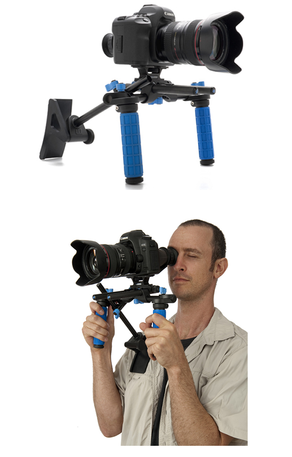
I recently became interested in DSLR photography and videography. Now doing video is something that needs a lot of stabilization so I did some research on what I might need. The first, and only a few brands make decent ones, brand that popped up was the RedRockMicro Series. These rigs cost at least three to four hundred dollars. So why not take something from the first day of class and apply it here: Zeitgeist. This terms applies to what I have done here; I have taken something of the 'past' and made a copy of it. In a sense, it's the ghost of design.

To the left is what the professional option is. Nice black with blue accents and rubber grip. To the left is what I made: copper and aluminum held together by welding and bolts. Now let's look at my design and how this fits the designer's needs.

 So ergonomics and designer's needs are roughly broken into five points from the most basic needs to the optional perks: safety, comfort, ease of use, performance, and aesthetics. So let's take a look at how well my design holds up against these five points.

Before I start tearing apart my own mock-up I need to be clear that I will critique this design as it is: an unfinished product. So, part one: safety. This design isn't the safest of designs by a long shot. Sharp edges from the 1/4 inch aluminum and mending braces offer many chances for scratches and the copper tubing can easily puncture the unsafe. The finished design (as planned) however will accommodate this with rubber stoppers/caps for tubing and corner pads for the edges.

Next up: comfort. I designed this in mind with the idea that I would be using this for extended periods of time. The original design with straight 90 degree angles were not the most comfortable. I used a 45 degree elbow for a relaxed and natural grip. And that lends into the ease of use. The natural angles help me hold the rig comfortably and the way it was designed was to be taken apart quickly and easily to be packed away.

Performance is a hard standard to measure. It is, more or less, only a measurement of how much better is it compared to what you are upgrading from. A shoulder mount upgrade from hand-held shooting is a whole new level of performance. And as for aesthetics, some flat black paint on the assembly and shiny new counterweights will make this into 'show room' condition.

I can sit here all day and point out many flaws in this design. But the main thing I wanted to point out was simple: a $300+ assembly versus one that I made for about $70. There is little to no difference in concept and performance so I feel that this is design in it's best. Consumer made, consumer used.

Word Count: 547

Monday, November 8, 2010

Word and Image: Or is it?

Word in Image. This concept and skill seems to be OH SO IMPORTANT to deserve two consecutive posts about the same topic. So since the previous post is about taking it apart and then combining the two into one design, now I'm going to observe using each other in the design. Now, this image may blow your minds!

Prepare:

Now this picture was found while browsing online for words and design. Then I thought about what about design of words? We've studied a bit on typography and how it influences design (much like the wall in the CBS lunchroom). But these words have a meaning to them, that of course relates to where it is positioned. If you look closely, all these words are placed correctly in the anatomy of the body, which lends an even more obvious yet some deeper meaning.

This is how words CAN BE images. That's just crazy. There is a way this is designed that you know that you're looking at a hand or arm. That's of course what first hits you. But as we look closely we see the background color bleeding through, so that can't be a solid hand. Then we realize that the words are telling us what is there. And that's just the end of it. Design to, in all sorts of ways, show and tell. That just makes me feel like I'm in grade school again: show and tell; but then again, isn't design all about play and having fun with what we're doing?

Now this only makes me wonder: is this made in Gestalt fashion? Is the rest of the word man's body listed by their parts? Design keeps me thinking, and of course, imagining.

Sunday, November 7, 2010

Word and Image: Delicious or Touching?

Word and image often are needed to better represent the thoughts of the designer or artist. Many times, both the image and words may be able to stand alone, but TOGETHER, they become even more meaningful and powerful. I'm going to take apart the words and motion images in a short film. This film was created in a film festival in February 2006 with the topic of "Food, Taste, and Hunger" and shortly thereafter moved people and opened eyes. This piece is called "Chicken a la Carte" and words and images here give this piece an even deeper meaning.

If a viewer were to look at the two independently, he may think that it's just a piece about world hunger or about a generous man. But have them both together gives a deeper meaning then this. Is this about a generous man? In some ways. Is this about world hunger? In some ways. Then what is it about?

There IS a deeper meaning when you watch how everything was designed together. There is a bigger image to just world hungry: it's a very specific area of world hunger. In a place that isn't miles and miles away from a metropolitan area, there is hunger there. But it's not a crazed hunger that takes over people. The people are still completely compassionate about each other. In such a desperate state, this man is still able to share what meager resources he was able to muster up with his community.

This piece of word and image is able to move a greater audience. Not because it was unique; no, this topic is covered in a variety of ways. But because of the design of the piece adds to a deeper meaning. Now here's a thought, word isn't limited to just written word. But the music lyrics (although written) add just as much as spoken word and the meaning behind is it limitless.

Spirit Running

Space. That's a interesting word. How does space relate to design? There has been all types of 'space' used by design, and art design is no exception. There should be no limitations to art and design, but many designers are faced with the 'forth wall' of design. This barrier that things have to appear whole and complete. Well, there is one piece of art I found that uses a concept we have learned well in class: Gestalt. Just like in McCloud's book, we assume that there are parts there that should be there, like his legs.

Let's take a loot at this piece of art design. We know that this is a pair of horses. One white and one black. For whatever reason the artist choose to make these horses polar opposites in terms of color, we ca only speculate. However, we can take what we see understand it's design.

There are parts of the horse missing, but we know that these horses are running 'through' the wall and that these parts sure will come in later. Also, looking at the craft of this piece, we see that the horse could have been cast in a full body, but what we see are strands of metal that make up the shape of a horse. This makes it feel as if this is the spirit of the horse, running through the gallery. There really is no need to show the whole piece to get a good feeling of what the artist and designer was thinking when they made this piece. Parts often speak just as loudly to us than the whole picture.

Monday, November 1, 2010

Everyday Design

Everyday design. This is an interesting concept to design. The way I think of it, everyday items are deigned much differently than other objects. Taking something from the film 'Objectified', many objects being made now have less and less correlation between the shape and physical body of the object with what the object is intended to do. So many stores have started to mass produced 'designed' objects and jacking up the prices.

What is this? This is a teapot. There was nothing wrong with the traditional teapot at all. It worked fine and there was no need to design a more efficient teapot. However, people wanted something more aesthetic, and that's what design has become. We have ASKED design to be more creative and more aesthetic. We ASKED design to be more appealing to the eye as it decorates our house. We may never actually use an object for anything but just to look good.

So now lets break down this teapot into a design. There are many elements that are included in this design, however simple it may seem. There is use of texture, material, and shape to create such a design. First off, the thing that catches my eye is where the water is set to boil. In a glass container located in the middle seems very clean and nice. We also see where our water levels are and when it boils too. Straight lines from this part of this design lends us the illusion of something sleek and smooth. However, all straight edges often makes us imagine harsh borders. To even this out, a stainless steel handle and body is added. The shiny metal adds to the smooth looking design and the curves brushes away any thoughts of harsh edges.

Simple and elegant. This design is something that I would leave in my house. Just to look at...never to use.

Interaction of Content and Form in 'Objectified'

It is rather hard to grasp the all the interaction of content and form in 'Objectified' and analyze it so critically. So let's break it down and look at certain aspects of the film itself to take apart. Let's look at the section about peelers and how people with arthritis have a hard time gripping them. The designs first talk about a common misconception of design. Many people think that 'design should be made for the average person' but design should actually be made for the extremes and the average people 'just fall into place in the design'. Then then back to the peeler: maybe it was designed for the average people in mind, but that's what makes it a weak design. So then the question is: how to make a peeler that can handle the extremes?

Designs get together and brainstorm ways to shape the handle to fit different extremes. This section of the film is what is being broken down in terms of content and form. Now, we have the very general documentary type footage where a person or group of people are interviewed on this project. This is the content of the sections. People are giving out information about the topic and are analyzing it. However, the form in which it is presented greatly helps our understanding on the subject. They are showing us the different models for handles and the design process that goes into making a prototype.

By combining the content into a form in which it is easy for us to visualize the process, we are able to understand it better. From the initial problem, through the design process, and then finally the finished product, it is all clearly illustrated in the way this movie was produced.